Italiana
Beautifully unfinished.
Headlines, large statements and expressive editorial moments · Regular 400
The visual and verbal ingredients of Artists’ Apothecary: a thoughtful editorial world where art, care and community meet.
Artists’ Apothecary makes creativity feel accessible, useful and emotionally nourishing. It creates small routes back to self, others and everyday beauty.
Creative remedies
for everyday life.
More personal than a gallery. More playful than a wellbeing brand. More meaningful than a craft shop.

The horizontal logo is the main collaborator and sponsor mark. Use the compact stacked logo when the space is square or narrow, and the A/A icon only where the full name will not fit. Always keep generous white space around every variation.
White is the main canvas. Black gives the layout structure and petal pink brings warmth. These three colours keep the visual identity calm, clear and recognisable.
Beautifully unfinished.
Headlines, large statements and expressive editorial moments · Regular 400Clear, warm and quietly contemporary. Made for generous reading.
Body copy, descriptions, forms and practical information · Regular 400, Medium 500, Semi-bold 600ART / CARE / COMMUNITY
DATES · NOTES · DETAILS
a note left in the margin ↘
Bradley Hand with a cursive fallback · Use sparingly for personal annotationsItaliana, Manrope and DM Mono are served through Google Fonts. The handwritten style uses the visitor’s available system cursive font as a fallback.
Warm, observant, clever, specific, gently rebellious and deeply human. We write like the thoughtful friend who always brings the good pens.
Invite rather than instruct. Choose sensory detail over wellness clichés. Make room for honesty and humour. Use short handwritten asides to add personality.
Sound perfect, but a little mystical with intrigue, not over-polished or falsely cheerful. We have proven methods, but also expect our community to put the work in.
Begin with a clear white editorial grid, then add a small number of tactile interruptions: a taped photograph, handwritten note, clipped artwork or overlapping image. The page should feel curated, never crowded.
Prefer analogue materials, process, hands, real gatherings and art with visible texture. Keep colour natural, crop with intention and allow one imperfect edge. Avoid glossy stock imagery, filters and decorative clutter.
70% calm editorial space, 20% tactile collage, 10% playful surprise.
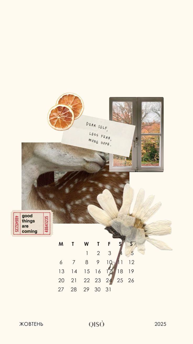
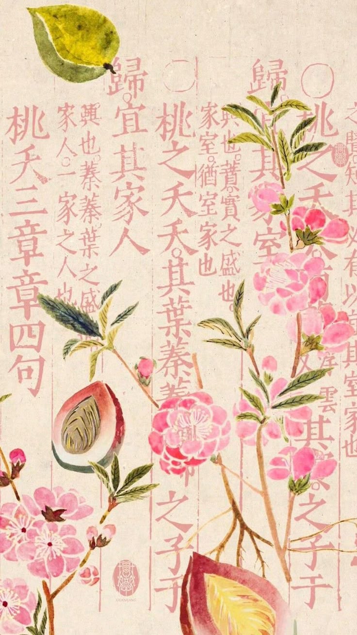
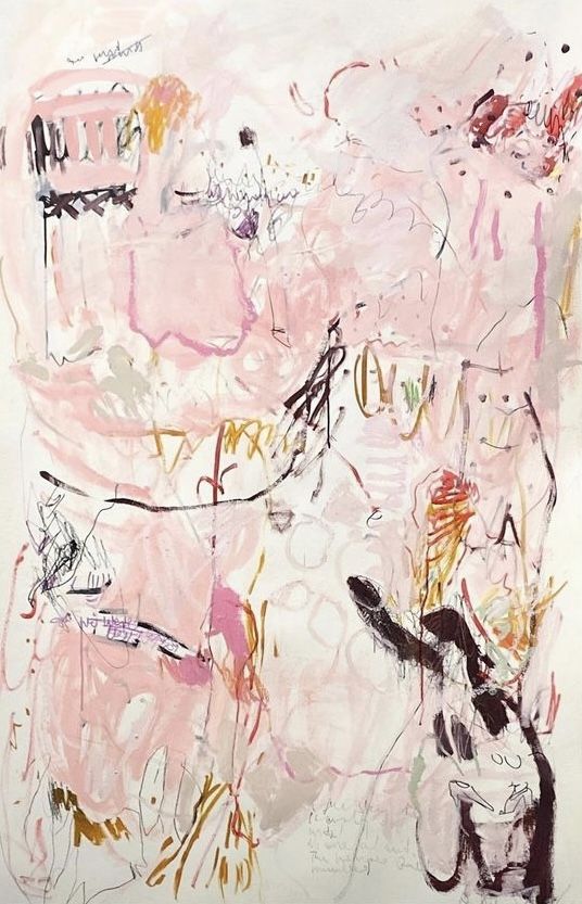 WHITE SPACE IS PART OF THE COLLAGE.